
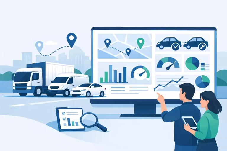
If your team is still pulling figures from spreadsheets, driver timesheets, service logs and phone calls just to answer a simple operational question, the problem usually is not effort. It is visibility. A fleet reporting dashboard gives operations teams one place to see what is happening across vehicles, assets and field activity, without chasing updates across multiple systems.
For most businesses, that matters when the pressure builds. A vehicle misses a service interval. A customer questions a chargeable hour. A site manager wants to know which plant is actually being used. A compliance manager needs cleaner records. In each case, the dashboard is not there to look impressive. It is there to shorten the gap between what happened and what your team can do about it.
Why a fleet reporting dashboard matters
Good reporting changes the quality of daily decisions. It helps fleet managers spot underused vehicles, operations managers reduce unnecessary downtime, and admin teams spend less time compiling reports by hand. That is the practical value – fewer blind spots, less paperwork, and faster action.
The strongest dashboards also pull together more than vehicle tracking. Many organisations are not managing a neat row of identical trucks. They are managing mixed fleets that can include utes, vans, heavy vehicles, trailers, plant equipment and non-powered assets, along with subcontractors or field staff. If reporting only shows part of that picture, teams still end up working around the gaps.
That is why dashboard design matters as much as data collection. You do not need more charts. You need reporting that reflects how your operation actually runs.
What a fleet reporting dashboard should show first
The best dashboards start with exceptions, not noise. If every data point is given equal weight, important issues disappear into the background. Operational teams need the first screen to answer a few clear questions. What needs attention now? What is costing money? What could create a compliance or safety problem if left alone?
Live location is often the obvious starting point, but by itself it is not enough. A map can show where vehicles are, yet tell you very little about utilisation, driver behaviour, idle time or service risk. The more useful view combines current activity with performance indicators that explain whether those movements are productive.
For many fleets, the core dashboard should include trip history, utilisation trends, idle time, after-hours use, speeding or harsh driving events, service due items, and exceptions linked to business rules. If your team invoices by job, shift or machine hours, then those usage records should be easy to verify. If compliance is a bigger pressure point, inspection status and maintenance alerts may deserve more prominence than route activity.
There is no perfect universal layout. A civil contractor managing vehicles and plant has different priorities from a community services provider coordinating field staff. The right dashboard depends on what creates cost, risk or delay in your operation.
Visibility is only useful if it leads to action
One common mistake is treating dashboards as passive reporting tools. In practice, they work best when they support immediate follow-up. If a unit has been idling excessively, a manager should be able to identify the pattern quickly and speak to the driver or supervisor. If an asset has not moved for weeks, someone should be able to check whether it is underused, unavailable, or simply in the wrong location record.
That is where simpler reporting often beats more detailed reporting. A dashboard packed with every available metric may satisfy curiosity, but it rarely helps busy teams prioritise. Clarity wins.
The metrics that make the biggest operational difference
Most fleet data falls into four useful categories – productivity, compliance, cost and safety. A dashboard does not need to treat them as separate silos, because in real operations they overlap.
Productivity reporting should help answer whether assets are being used effectively. That can include engine hours, trip frequency, start and finish times, site attendance, stop duration and utilisation by asset type. These numbers become especially valuable in mixed fleets, where a trailer or piece of plant can quietly disappear from planning simply because it lacks clear usage visibility.
Compliance reporting should make scheduled obligations easier to manage, not harder. Service intervals, inspection reminders, registration dates and maintenance history all need to be visible in a way that reduces manual follow-up. If your team is still relying on wall calendars or memory, the dashboard is not doing enough heavy lifting.
Cost reporting usually starts with fuel-related behaviours such as idling, route inefficiency and after-hours use, but it should also help expose avoidable downtime and low utilisation. A vehicle that moves every day is not always productive. A machine sitting on site for a month might still be billed, but that does not mean it is being allocated well.
Safety reporting should give context, not just event counts. Speeding, harsh braking, rapid acceleration and dash cam events can all be useful, but only if managers can separate one-off incidents from recurring patterns. The goal is fair, practical intervention – not overwhelming supervisors with raw alerts.
A fleet reporting dashboard should reduce admin, not create more of it
This is where many reporting platforms fall short. They collect data well enough, but the office still spends hours exporting files, combining formats and correcting inconsistencies before the numbers are usable. If reporting does not reduce admin effort, it is only moving the work around.
A practical dashboard should make routine reporting easier for managers, payroll teams, compliance staff and business owners. That might mean automated service reminders, ready-to-run utilisation reports, cleaner driver activity records or more accurate times linked to asset movement. The exact setup varies, but the aim is the same: less manual handling and fewer arguments over what happened.
This is particularly important for businesses growing beyond informal processes. What worked with five vehicles and one coordinator starts to strain when the fleet expands, new asset types are added, or customer reporting becomes stricter. At that point, reporting is no longer an admin task in the background. It becomes part of how the business protects margin and maintains control.
Different teams need different views
One dashboard should not force every user into the same reporting lens. A fleet manager may care about utilisation trends and maintenance risk. An operations manager may need dispatch visibility and proof of service delivery. A business owner may want exceptions, asset performance and cost signals at a glance.
That does not mean each person needs a completely separate system. It means the reporting layer should be flexible enough to surface the right information for the right role. When teams can find what they need quickly, adoption improves. When they cannot, they go back to phone calls, spreadsheets and guesswork.
The trade-off between more data and better decisions
It is easy to assume that more telematics data automatically leads to better outcomes. Sometimes it does. Often it just creates clutter.
A useful fleet reporting dashboard balances breadth with relevance. If you run a highly regulated transport operation, detailed compliance and driver behaviour reporting may be worth the extra depth. If you manage a mixed fleet of service vehicles and equipment, simpler reporting across all assets may be more valuable than deep reporting on only one category.
That is why solution fit matters. The dashboard should reflect the decisions your team needs to make every day, not just the features available in the software. In many Australian operations, especially those managing both powered and non-powered assets, a broad operational view can be far more useful than a specialist tool that only handles vehicles well.
The strongest platforms make this easier by combining tracking, maintenance visibility, driver insights and asset reporting in one place. That kind of setup helps teams spend less time reconciling separate systems and more time acting on the information.
Choosing a fleet reporting dashboard that works in the real world
When assessing a dashboard, ask how quickly a new user could answer everyday operational questions without extra training. Can they see which assets are active, which need attention, and where performance is slipping? Can they trust the reports enough to act on them? Can the system scale across different asset types without becoming harder to manage?
Usability matters more than vendors sometimes admit. A feature-rich system that nobody uses properly will not improve visibility, compliance or uptime. An easier platform with clear reporting often delivers better value because teams actually rely on it.
Support matters as well. Reporting needs change as the business changes. New depots open, compliance requirements shift, customer expectations grow, and different asset classes are added. Having direct support from people who understand operational realities can make the difference between a dashboard that looked good in a demo and one that keeps delivering value on the ground. That is a big reason many businesses prefer a practical, service-led partner such as Eziway Tech rather than a one-size-fits-all tracking setup.
A fleet reporting dashboard should make your operation easier to run on an ordinary Tuesday, not just give leadership a nicer monthly report. If it helps your team spot issues earlier, cut admin, improve accountability and keep more assets productive, it is doing the job it was meant to do.